

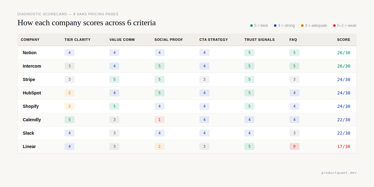
TL;DR: The Scorecard
- Notion and Intercom tie at 26/30 — industry-leading social proof, trust signals, and FAQ. Notion wins on tier clarity; Intercom wins on value communication.
- Stripe, HubSpot, Shopify all score 24/30 — strong trust and value communication, but tier clarity suffers from complex product navigation.
- Calendly and Slack score 22/30 — clean tier design but weak social proof on the pricing page itself.
- Linear scores 17/30 — generous free tier and clean design, but missing FAQ entirely and weak social proof.
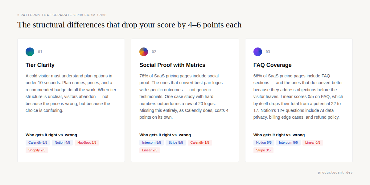
- The pattern is clear: the best pricing pages combine tier clarity with social proof and trust signals. Missing any one of these three drops your score by 4-6 points.
We scored each company across 6 criteria on a 5-point scale. The table below shows the results ranked by total score.
| Company | Tier Clarity | Value Comm | Social Proof | CTA Strategy | Trust Signals | FAQ | Total |
|---|---|---|---|---|---|---|---|
| Notion | 4/5 | 4/5 | 4/5 | 4/5 | 5/5 | 5/5 | 26/30 |
| Intercom | 3/5 | 4/5 | 5/5 | 4/5 | 5/5 | 5/5 | 26/30 |
| Stripe | 3/5 | 5/5 | 5/5 | 3/5 | 5/5 | 3/5 | 24/30 |
| HubSpot | 2/5 | 4/5 | 5/5 | 4/5 | 5/5 | 4/5 | 24/30 |
| Shopify | 2/5 | 5/5 | 4/5 | 4/5 | 5/5 | 4/5 | 24/30 |
| Calendly | 5/5 | 3/5 | 1/5 | 4/5 | 4/5 | 4/5 | 22/30 |
| Slack | 4/5 | 3/5 | 4/5 | 4/5 | 4/5 | 3/5 | 22/30 |
| Linear | 4/5 | 3/5 | 2/5 | 3/5 | 5/5 | 0/5 | 17/30 |
The highest scorers combined clear tier design with strong social proof and thorough FAQ sections. The lowest scorers failed on one or two critical dimensions despite getting everything else right.
The 6 Evaluation Criteria
Every pricing page serves the same fundamental purpose. A visitor arrives, evaluates their options, and decides whether to convert.
We measured how well each page supports that journey using 6 criteria, each scored from 0 to 5.
- Tier Clarity: Can a cold visitor understand the plan options in under 10 seconds? A score of 5 means plan names, prices, and differentiation are instantly scannable.
- Value Communication: Does the page communicate outcomes and benefits rather than just features? A score of 5 means every tier is tied to a specific business outcome.
- Social Proof: Are logos, testimonials, user counts, or third-party validation present and visible? A score of 5 means specific case studies with hard metrics are visible on the page.
- CTA Strategy: Are calls-to-action clear, differentiated by tier, and action-oriented? A score of 5 means each tier has a purpose-built CTA with action-oriented copy.
- Trust Signals: Are security badges, compliance certifications, and support options visible? A score of 5 means trust signals are woven into the pricing cards themselves.
- FAQ: Are real objections answered on the page? A score of 5 means 10+ questions addressing real objections are answered on the page.
This scoring framework lets us compare apples to apples across companies with completely different pricing models. Now let us look at each page.
1. Notion — 26/30
Notion tied for first place in our evaluation. Their pricing page balances comprehensive information with a clear recommended tier. You can see the full page layout in the screenshot below.

What They Get Right
Notion names its plans after the stage of company maturity. Free, Plus, Business, and Enterprise map directly to how a visitor thinks about their own organization. A visitor can instantly self-identify and know which plan fits their situation.
The H1 reads "ONE TOOL TO RUN YOUR COMPANY," which reinforces this positioning before the visitor even sees pricing.
The comprehensive FAQ section includes 12 or more questions covering AI data usage, billing mechanics, block limits, student discounts, and refund policies. 66% of SaaS pricing pages include an FAQ section, and Notion's is among the most thorough we have seen. The AI data privacy question — asking whether data is used to train models — is a trust builder that most competitors ignore entirely.
Annual discount transparency is handled well. The "Save up to 20% with yearly" message is prominent, and the monthly and yearly toggle sits at the top of the pricing section. The RECOMMENDED badge on the Business plan is a simple herd-behavior cue that guides buyers toward the plan Notion wants them to choose.
What They Get Wrong
AI credits confuse the pricing model. Notion's base pricing is per-seat at 9.50 to 19.50 euros per member per month. But Custom Agents are priced at $10 per 1,000 credits.
This hybrid approach makes the total cost of ownership difficult to calculate. A visitor cannot answer the question of "how much will this cost?" without understanding their AI consumption patterns in advance.
The feature comparison matrix below the pricing cards is extensive. Scrolling through dozens of rows to find the one feature you care about creates cognitive overload. Progressive disclosure is the antidote, and Notion partially implements this with toggles — but the sheer volume of features still overwhelms first-time visitors.
Notion ties for first. The winning combination: persona-specific tier naming + thorough FAQ + visible annual discount. The RECOMMENDED badge costs nothing to implement and guides buyers with zero friction.
What to Steal
The persona-specific tier naming. Free, Plus, Business, Enterprise maps to how buyers think about their own company stage. Your plan names should help visitors self-identify, not force them to decode your marketing terminology. This single change can reduce bounce rates by making the page instantly relevant.
2. Stripe — 24/30
Stripe's page is the gold standard for usage-based pricing transparency, but the density of information works against quick comprehension. The screenshot below shows the full product catalog layout.

What They Get Right
Transparent per-transaction pricing is Stripe's defining strength. The Standard plan is pay-as-you-go with rates clearly listed for different card types. No setup fees, no monthly fees, no hidden fees.
For a usage-based product, this is the gold standard. The price is directly tied to the value metric — transactions processed. A customer who processes $10,000 knows exactly what they will pay.
Enterprise proof at scale is handled with specific metrics. More than 100 market leaders process over $1 billion annually on Stripe. The page pairs logos from BMW, Amazon, Maersk, and Twilio with specific performance data. The Forrester TEI report claiming 326% ROI for Stripe implementers is linked directly on the page. This is not just social proof — it is ROI proof.
Product-by-product pricing breakdown adds honesty. Stripe breaks down Billing, Tax, Sigma, and Data Pipeline with individual prices for each. Each product has its own pricing logic, and the page does not try to hide it.
What They Get Wrong
The page is dense. Stripe's pricing page is essentially a product catalog with pricing attached. For a developer who wants to know how much payments will cost, the answer is clear. For a founder estimating their full Stripe stack, the answer requires mental math across 10 or more product sections.
The two-tier structure of Standard and Custom feels incomplete. The optimal tier count is 3-4 plans. Stripe's binary structure works for their usage-based model but does not give growing companies a natural upgrade path between pay-as-you-go and enterprise custom pricing.
What to Steal
The per-transaction transparency. If your product's value scales with usage, show the math. Do not hide behind "contact us" when a simple formula would build more trust. Every fee visible and calculable is a trust signal that competitors cannot match.
3. Calendly — 22/30
Calendly's tier clarity is nearly perfect, but the absence of social proof drags the overall score down significantly. The screenshot below shows the clean four-tier layout.

What They Get Right
The tier structure is dead simple: Free at $0, Standard at $10 per seat, Teams at $16 per seat, and Enterprise at $15,000 annually. Four tiers with clear price progression. The Recommended plan badge on Teams makes the choice effortless — this is the 3-4 tier sweet spot that research recommends.
Annual savings are front and center. Save 16% on Standard and save 20% on Teams are displayed as prominent badges. The default billing view is yearly, which nudges visitors toward the higher-commitment, lower-churn option.
Clear feature gating makes each tier's value obvious. Free gets the core scheduling. Standard adds integrations and automated reminders. Teams adds Salesforce routing, advanced admin, and org-wide controls. The value step-up between tiers is visible without reading fine print.
What They Get Wrong
Social proof is missing from the pricing page entirely. No customer logos, no testimonials, no user count. For a product used by millions, this is a missed opportunity. 76% of SaaS companies include some form of social proof on their pricing pages — Calendly is in the 24% that do not.
Enterprise is a price wall. The $15,000 per year figure appears with no "starting at" qualifier and no feature hint. For a product where Standard is $10 per seat, the jump to $15,000 feels arbitrary. A "starting at $15,000 for 50+ seats" framing would give visitors the context they need to self-qualify.
What to Steal
The tier naming simplicity. Free, Standard, Teams, and Enterprise use no abstract names and no clever marketing labels. A visitor knows exactly what they are getting. If your audience is small to medium business, plain language outperforms creative naming every time.
4. Linear — 17/30
Linear scored the lowest in our set. Their radical minimalism works for a developer audience, but the absence of an FAQ section is a real conversion killer. The screenshot below shows the stripped-down layout.

What They Get Right
Radical minimalism is Linear's defining characteristic. The heading says "Pricing." Four plans with per-user pricing follow. A feature comparison table sits below. No fluff, no marketing copy, no personality. For a developer tool targeting engineers who want to get in and out fast, this is the right call.
Clean feature gating makes the value progression logical. Free caps at 2 teams and 250 issues. Basic expands to unlimited issues and 5 teams. Business adds unlimited teams, private workspaces, and AI features. Enterprise adds compliance, admin controls, and priority support. Each step-up is easy to understand.
Security badges are prominently displayed. HIPAA compliance, SAML SSO, SCIM, SOC 2, audit log, and IP restrictions are in the feature comparison table where enterprise buyers look for them. Linear does not bury these in a footer.
What They Get Wrong
There is no FAQ section. Linear's pricing page has zero frequently asked questions. 66% of SaaS pricing pages include FAQs, and for good reason — they address the objections that prevent conversion.
Questions like "what happens when you exceed 250 issues on Free" or "what is included in the Enterprise plan" are real questions that Linear does not answer on the page.
Linear's minimalism earns developer respect but costs conversions. The absence of an FAQ alone costs 5 points. A single FAQ section addressing common objections would push Linear from last place to mid-table — without touching the rest of the design.
What to Steal
The no-nonsense approach. If your audience is technical buyers who value efficiency over marketing, strip the page down to plans, prices, and features. Everything else is noise. But pair this minimalism with an FAQ section that addresses real objections. Minimalism without answers is just silence.
5. Slack — 22/30
Slack's clean four-tier structure is well-executed for a collaboration tool, but the feature matrix complexity and an overly generous free tier hold them back. The screenshot below shows the current pricing layout.

What They Get Right
The four-tier structure is clean and well-differentiated. Free, Pro, Business+, and Enterprise+ each have a distinct positioning — from personal use to team productivity to AI-powered work to enterprise-grade compliance. A visitor can self-identify quickly without reading the fine print.
Clear enterprise proof is woven throughout the page. Enterprise logos, case studies, and security badges support the upgrade path from Free to Enterprise+ with a clear value narrative.
The free tier allows genuine product evaluation. With 90 days of message history, up to 10 apps, and 1-on-1 meetings included, teams can test Slack thoroughly before committing. This reduces the friction of initial adoption more effectively than any discount.
What They Get Wrong
The feature comparison table is long and dense. For a product with hundreds of features, the full grid is necessarily comprehensive — but presenting it without filtering or progressive disclosure creates cognitive load for a first-time visitor who just wants to know which plan fits their team.
What to Steal
The free tier feature set. With 90 days of message history, up to 10 app integrations, and 1:1 huddle meetings included, the Slack free plan gives teams enough functionality to form a genuine habit. If your product can afford a generous free tier that delivers real value, it is a more effective acquisition channel than any discount.
6. Intercom — 26/30
Intercom tied for first place alongside Notion. Their outcome-based AI pricing is the most innovative pricing mechanism in this entire set. The screenshot below shows the Essential, Advanced, and Expert tier structure.

What They Get Right
Outcome-based AI pricing is genuinely innovative. Intercom charges $0.99 per Fin AI resolution, not per seat or per conversation. A resolved conversation is worth money to the customer. An unanswered conversation is not. Intercom prices accordingly.
Social proof is specific and metric-driven. Synthesia resolved more than 6,000 conversations and saved more than 1,300 hours with an 87% self-serve rate. Dental Intelligence achieved a 97% Fin CSAT score. Culture Amp hit 95% global CSAT. These are not vague testimonials — they are measurable outcomes that reduce purchase hesitation.
The 14-day full-access trial with no credit card required removes the first barrier to evaluation. The Fin Million Dollar Guarantee adds a risk-reversal layer that almost no competitor offers.
What They Get Wrong
The pricing structure is complex. Three base plans plus add-ons for Pro at $99 monthly, Copilot at $29 per agent monthly, and Proactive Support Plus at $99 monthly — plus per-outcome AI pricing, plus an external helpdesk option. A buyer needs a spreadsheet to model their total cost.
Wide price gaps create a mid-market chasm. The jump from $29 to $85 to $132 per seat means a 10-person team pays $290, $850, or $1,320 monthly. That is a massive gap with no intermediate step.
What to Steal
The outcome-based pricing transparency. If your product delivers measurable outcomes, price per outcome. Intercom's $0.99 per resolution is easy to justify to a CFO because it maps directly to a saved support ticket. Your buyers will pay more when they can see exactly what they are buying.
7. HubSpot — 24/30
HubSpot's free CRM is the best lead-generation engine in SaaS, but the per-hub pricing model creates calculator fatigue for buyers trying to estimate costs. The screenshot below shows the hub-based pricing structure.

What They Get Right
The free CRM is the best lead-generation tool in SaaS. 194,000 customers in 120 or more countries started with free. The free tier includes CRM, forms, email marketing, and live chat — giving teams real functionality to evaluate before spending a dollar.
Per-hub pricing allows modular adoption. Marketing, Sales, Service, CMS, and Operations hubs are priced separately. A team can start with one hub and expand as their needs grow. This is a land-and-expand strategy baked directly into the pricing page itself.
Social proof is overwhelming. 194,000 customers, case studies from DoorDash and Trello and SurveyMonkey, G2 Leader badges, and the claim of being the most popular CRM globally. The page leaves no doubt that HubSpot is an established, trusted platform.
What They Get Wrong
Pricing complexity creates calculator fatigue. Per-hub, per-seat, and per-feature pricing means a buyer cannot answer the question of "what does this cost?" without building a custom quote. The Starter tier starts at $20 per user, but Professional ranges from $89 to $800 per user depending on the hub, and Enterprise reaches $150 to $4,300 per user.
The escalation from $20 to $4,300 per month is a 215x increase on some hubs. Even when the value justifies the price, the perception of that gap creates hesitation before a salesperson can intervene.
What to Steal
The free tier as a lead-generation engine. If your product has a genuinely useful free tier, make it the centerpiece of your pricing page. HubSpot's 194,000 customers started there. A free product that delivers real value is the most credible acquisition channel you can build.
8. Shopify — 24/30
Shopify's dual pricing model of subscription plus transaction rates creates natural upgrade incentives, but the 6 plan options create analysis paralysis. The screenshot below shows the full pricing layout.

What They Get Right
The 1 euro per month for the first 3 months intro offer reduces trial friction to near-zero. A 3-day free trial is standard. A 3-month trial at virtually no cost is a different category of commitment reduction — merchants can build a real store, process real transactions, and validate the platform before paying the full price.
Transaction rate decreases create natural upgrade incentives. The Basic plan charges 1.9% plus 0.25 euros per online transaction. The Advanced plan charges 1.6% plus 0.25 euros. A merchant processing 50,000 euros monthly saves 150 euros per month on transaction fees alone by upgrading. The upgrade sells itself.
Specific ROI claims build confidence. Shopify checkout converts 15% better on average than other commerce platforms. These are specific, defensible claims that differentiate Shopify from generic website builders.
What They Get Wrong
6 plan options create analysis paralysis. Basic, Grow, Advanced, Plus, Starter, and POS Pro are too many choices for a first-time visitor. The optimal tier count is 3-4 plans. Shopify has doubled that.
Dual pricing also requires mental math. A visitor needs to calculate the monthly subscription plus the transaction rates plus the third-party payment provider fees if they do not use Shopify Payments. This cognitive load is one that simpler competitors do not impose.
What to Steal
The transaction-rate-based upgrade incentive. If your product has usage-based costs, structure higher tiers to reduce those costs. The upgrade sells itself when the buyer can calculate their own savings.
The Patterns: 7 Actionable Takeaways
We analyzed 8 pricing pages from companies generating hundreds of millions in revenue. Across all of them, 7 patterns emerged consistently.
These are not opinions. They are structural truths about how high-converting pricing pages are built.
- The middle tier wins. Every pricing page that uses 3 or more tiers highlights a recommended or most popular middle tier. The RECOMMENDED badge is the highest-ROI element you can add to a pricing page. It costs nothing to implement and guides buyers toward the plan you want them to choose.
- Annual discounts are table stakes. Every company in this set offers annual pricing. The discounts range from 16% to 25%. If you do not offer annual pricing, you are behind the industry standard.
- Enterprise pricing is always custom. Even companies with transparent self-service pricing switch to "contact sales" or a flat annual rate for enterprise. The threshold varies, but the pattern is universal.
- Social proof converts at the moment of decision. 76% of SaaS companies include social proof on their pricing pages. The highest-performing examples pair logos with specific metrics.
- FAQ sections address objections before they become bounces. 66% of SaaS pricing pages include FAQs. The pages that do not, like Linear, leave real questions unanswered.
- Transparent pricing builds trust even when the price is high. Buyers trust what they can calculate. They distrust what they cannot.
- Mobile browsing is non-negotiable. 60% of users browse pricing pages on mobile. If your pricing table does not collapse cleanly into a mobile-friendly layout, you are losing conversions from the majority of your visitors.
The three elements that separate 26/30 from 17/30: tier clarity, social proof with specific metrics, and a thorough FAQ section. Every company in this set that is missing one of these three dropped 4-6 points. You do not need to redesign your pricing page — you need to audit it against these three criteria first.
These 7 patterns should serve as a checklist when you design or redesign your own pricing page. Each one is backed by data from multiple companies, not by a single anecdote.
FAQ: Pricing Page Design
How many tiers should my pricing page have?
3-4 is optimal. Fewer than 3 looks incomplete and suggests you have not thought through your market segments. More than 5 causes analysis paralysis and pushes visitors toward decision avoidance. The middle tier should capture 60-70% of conversions.
Should I show monthly or annual pricing by default?
Show monthly pricing as the headline number because it looks smaller and less intimidating. Display the annual discount prominently alongside it. 71% of SaaS companies offer annual pricing, and the default toggle should be annual to nudge visitors toward the lower-churn option.
Do I need an FAQ on my pricing page?
Yes. 66% of SaaS pricing pages include FAQs, and the ones that do convert better because they address objections before the visitor leaves the page. Answer the questions your sales team hears most often. If a question stops a deal in its tracks, it belongs on the pricing page.
Should I include customer logos on my pricing page?
If you have them, yes. Social proof reduces purchase hesitation and builds trust at the exact moment a visitor is deciding whether to commit. But generic logos alone are weak. Pair each logo with a specific metric or outcome. One case study with hard numbers is worth more than a row of 20 logos.
What is the single most important element of a pricing page?
Tier clarity. A cold visitor must understand the plan options in under 10 seconds. If they need to read paragraphs of fine print or use a calculator, you are losing conversions. Start with clear tier naming, visible pricing, and a recommended badge on your target tier. Everything else is optimization on top of that foundation.
Sources
- Notion Pricing Page — scraped and analyzed April 2026
- Stripe Pricing Page — scraped and analyzed April 2026
- Calendly Pricing Page — scraped and analyzed April 2026
- Linear Pricing Page — scraped and analyzed April 2026
- Slack Pricing Page — scraped and analyzed April 2026
- Intercom Pricing Page — scraped and analyzed April 2026
- HubSpot Pricing Page — scraped and analyzed April 2026
- Shopify Pricing Page — scraped and analyzed April 2026
- Vezadigital — Best SaaS Pricing Page Examples
- InfluenceFlow — SaaS Pricing Page Best Practices 2026
- Eleken — SaaS Pricing Page Design
- PipelineRoad — SaaS Pricing Guide

About the Author
Jake McMahon builds growth infrastructure for B2B SaaS companies — analytics, experimentation, and predictive modeling that turns product data into revenue decisions. He has conducted pricing page audits across multiple engagements, analyzing conversion patterns, tier architecture, and pricing communication. The teardown framework in this article is built from direct analysis of live pricing pages, not secondary sources. Book a diagnostic call to discuss your pricing page.