
TL;DR
- Churn compounds. A 5% monthly churn rate does not mean you lose 5% of customers per year. It means you lose 46%. That is the number that should be in every board deck.
- The detection layer tracks 4 behavioral signal categories: engagement velocity, feature breadth contraction, support pattern shifts, and billing signals. These are leading indicators that surface weeks before cancellation.
- The scoring layer combines 3-5 signals into a composite health score (0-100). A 40% drop in weekly logins predicts churn with 78% accuracy.
- The intervention layer applies 7 archetype-specific playbooks matched to the churn driver. Onboarding gap gets a walkthrough. Pricing concern gets a value review. The playbook is determined by the diagnosis.
- The system compounds. Every intervention outcome trains the model. Month 1: the system predicts. Month 3: the system learns. Month 6: the system gets better on its own.
The Churn Math Nobody Talks About
Churn is one of those problems that looks simple until you have been running weekly churn reports for three months and the number has not moved.
Most teams approach churn retrospectively. They build the dashboard. They hold the retrospective. They send the exit survey. They conclude that customers leave because they are unhappy and the product did not deliver value.
This is not wrong. It is just too late.
The teams that consistently reduce churn are not running better retrospectives. They are running early warning systems. This piece documents that system.
The Compounding Trap: How Monthly Churn Translates Into Massive Annual Customer Loss
Most teams track monthly churn rate and move on. Churn compounds.
A 5% monthly churn rate does not mean you lose 5% of customers per year. It means you lose 46% per year — because each month's loss compounds on the previous month's smaller base.
| Monthly Churn | Annual Churn |
|---|---|
| 2% | 21% |
| 3% | 31% |
| 5% | 46% |
| 7% | 56% |
The difference between 5% monthly churn and 2% monthly churn is not 3 percentage points. It is the survival of your customer base.
The good news: churn varies dramatically by segment. At the SMB level, 3-7% monthly logo churn is normal with NRR of 80-100%. At Mid-Market, 1-2% monthly churn with NRR of 100-115%. At Enterprise, less than 1% monthly churn with NRR of 110-140%.
If your SMB churn is 5% and your Enterprise churn is 3%, your Enterprise product is fine — your SMB onboarding is broken.
Segment comparison before drawing conclusions about product quality.
One final distinction: 20-40% of churn is involuntary — payment failures, expired cards, billing errors. That is the easiest part to fix with a proper dunning email system.
The remaining 60-80% is voluntary — customers who chose to leave. That is what the diagnosis system targets.
A 5% monthly churn rate means you lose 46% of your customers per year. At $5M ARR, that is $2.3M in annual revenue at risk. A 5% relative churn reduction saves $150K/year — the fastest NRR improvement available.
Now the system that changes this.
The 3-Layer Churn Diagnosis System
The system has three layers. Each solves a different problem. All three are required for the system to compound.
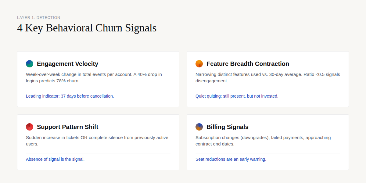
Layer 1: Detection — The Behavioral Signals That Predict Churn
Churn does not happen on the day the customer cancels. It happens over 4-8 weeks of declining engagement, narrowing feature use, and deteriorating sentiment. The detection layer identifies these signals before the cancellation.
Signal 1: Engagement Velocity
What to measure: Week-over-week change in total events per account.
The churn pattern: Users do not stop using your product all at once. They use it less and less until they stop. A 40% drop in weekly logins predicts churn with 78% accuracy. This is the single strongest individual signal — stronger than NPS, stronger than support ticket count, stronger than feature adoption rate.
The insight: A 40% drop in weekly logins predicts churn with 78% accuracy. No other single signal outperforms it. Build this metric first.
In our work with a healthcare SaaS client, we found that engagement velocity decline started an average of 37 days before cancellation. The customers who said "it came out of nowhere" had a visible 37-day warning they were not measuring. That single signal was the foundation of a 23% churn reduction in 90 days.
Signal 2: Feature Breadth Contraction
What to measure: Number of distinct features used in the last 14 days vs. the user's 30-day average.
The churn pattern: A contraction ratio below 0.5 (using less than half their normal feature set) means the user is disengaging from all but the core workflow. This is the behavioral equivalent of quiet quitting — still present, but not invested.
The insight: The number of distinct features a user engages with is a stronger predictor than their total event volume. Volume can be noisy. Breadth contraction is a directional signal.
In an HR platform engagement, retained users used an average of 8.3 distinct features in their first 30 days, while churned users used 2.1. The gap was not just in volume — it was in which features.
Churned users clustered on reporting features but never configured integrations, which is where the product's real value lives. We identified 6 distinct churn drivers in that single cohort and mapped a $250K-$400K conversion opportunity.
Signal 3: Support Pattern Shift
What to measure: Change in support ticket frequency and sentiment.
Two churn patterns:
Frustration spike: Sudden increase in support tickets, especially with escalating language ("third time," "still broken," "need this resolved"). Bad customer service accounts for 14% of all churn.
Silent disengagement: Users who previously filed tickets regularly stop filing them. They did not solve the problem — they stopped caring enough to report it. This is the harder pattern to detect because the absence of signal is the signal.
The insight: The absence of support tickets from a previously active user is a churn signal, not a sign of satisfaction. Flag the silence, not just the noise.
In a HIPAA-compliant forms platform engagement, we found that 37+ analytics events were available for churn prediction, including support ticket frequency, resolution time, and escalation patterns. Using these signals, we achieved a 40-50% save rate on cancellation attempts — protecting $105-$155K in annual MRR.
Signal 4: Billing Signals
What to measure: Subscription changes (downgrades, seat reductions), failed payments, contract end date approaching.
The churn pattern: A seat reduction is often the first visible sign of account-level churn. If a 10-seat account drops to 6 seats, the remaining 4 are at risk too. The budget squeeze archetype often starts here — a customer who is financially constrained but still values the product.
The insight: Seat reductions are an early warning, not a late-stage symptom. A single seat reduction should trigger a CSM touchpoint, not a quarterly business review.
Layer 2: Scoring — The Composite Health Score
The detection layer produces signals. The scoring layer combines them into a single number that tells you who needs attention today.
The Composite Health Score (0-100)
For each user or account, calculate weekly:
Health Score = (engagement_velocity > -20% ? 25 : max(0, 25 + velocity_penalty)) + (feature_breadth_ratio >= 0.7 ? 25 : max(0, 25 - breadth_penalty)) + (support_sentiment >= neutral ? 25 : support_penalty) + (billing_signals == none ? 25 : billing_penalty)
Each component is worth 25 points (100-point scale). Negative scores are possible if all signals are bad — that is intentional. A deeply unhealthy account should score below zero.
The weights above (25/25/25/25) are the starting point. After 3 months of outcome data, you should adjust weights based on which signals most strongly predict churn in your product. In our experience, engagement velocity typically emerges as the dominant signal — so its weight increases from 25 to 35, and the other 3 shrink proportionally.
The insight: The starting weights are a hypothesis. After 90 days of outcome data, the weights should reflect your product's actual churn drivers, not a generic template.
Risk Thresholds
| Score | Risk Level | Action |
|---|---|---|
| 75-100 | Healthy | No action needed. Monitor weekly. |
| 50-74 | Watch | Flag for CSM awareness. No outreach needed yet. |
| 25-49 | At-risk | CSM outreach within 48 hours. Match playbook to churn driver. |
| 0-24 | Critical | Immediate senior CSM escalation. Executive outreach if ACV > $50K. |
| <0 | Terminal | Post-mortem analysis. Win-back campaign. |
Validation: Does the Score Actually Predict?
The most common mistake in health score design is building a score and never checking whether it predicts anything. Here is the validation workflow:
Pick a historical period: Users who churned 3-6 months ago. Calculate their health score 30 days before churn.
Measure: What percentage scored below 50? (Target: 70%+)
Measure: What percentage of non-churned users scored below 50 in the same period? (Target: <20% — this is your false positive rate.)
If false positive rate exceeds 30%, your CS team will stop trusting the score. Tighten the thresholds.
The insight: A health score that cannot trigger an intervention within 24 hours is a vanity score. The score exists to drive action, not to look pretty on a dashboard.
Layer 3: Intervention — The 7 Archetype Playbooks

The detection layer tells you something is wrong. The scoring layer tells you who is most at risk. The intervention layer tells you what to do about it.
Here are the 7 primary churn archetypes in B2B SaaS:
1. Onboarding Gap: Customer has not discovered core value. Fix: Guided walkthrough of the critical workflow. Typically a 30-minute session with a CSM or onboarding specialist.
2. Pricing Concern: Customer values the product but questions the price-to-value ratio. Fix: Business value review. Quantify the ROI relative to the subscription cost. This is a CSM conversation that may include discount approval from management.
3. Feature Gap: Customer needs capabilities the product does not offer. Fix: Roadmap briefing. Show them what is coming. Explore workarounds. If the gap is strategic, this is a solutions engineering conversation.
4. Support Frustration: Customer has had repeated negative experiences with support. Fix: Escalation to senior CSM or direct access to engineering. This is a damage-control play that requires immediate attention and executive visibility.
5. Competitive Displacement: Customer is evaluating alternatives. Fix: Competitive analysis and executive executive engagement. This may require accelerating investment in the product or the relationship.
6. Budget Constraint: Customer is cutting software costs due to economic conditions. Fix: ROI quantification and payment flexibility options. This is a conversation that involves finance, not just CS.
7. Success: Customer has achieved their goal and no longer needs the product. Fix: Expansion conversation. Look for adjacent use cases. This is the churn archetype you want — it is solvable with upsell.
The insight: Intervention without archetype classification produces a generic retention offer. Generic retention offers do not fix onboarding gaps. Match the playbook to the driver.
The 3-Layer Churn Diagnosis Worksheet
A practical template for mapping your detection signals, scoring thresholds, and archetype playbooks. Built for CS teams running health scores in PostHog, Mixpanel, or Amplitude.
What the Numbers Say About Churn Diagnosis
The financial case for a structured diagnosis system is straightforward. The operational case requires evidence that the system actually changes outcomes.
The Financial Stakes
At $5M ARR with 5% monthly churn, you are losing $250K in MRR each month. Reducing that by 5% relative is $12.5K/month — $150K/year. That is the fastest NRR improvement available to most teams.
The intervention layer is where the system either works or does not. In the HIPAA-compliant forms platform engagement, the team achieved a 40-50% save rate on cancellation attempts — protecting $105-$155K in annual MRR.
That is the output when detection, scoring, and intervention are aligned.
The insight: The detection layer identifies the problem. The scoring layer prioritizes the response. The intervention layer saves the revenue. Without the intervention layer, the other two are noise.
A generic at-risk list produces 45 false positives per 100 flags. An archetype-classified list produces 10 false positives per 100 flags. That 3.5x improvement in CS team efficiency is the highest-ROI improvement to any churn diagnosis system.
The Compounding Feedback Loop
The system gets better over time. Every intervention outcome — saved, lost, deferred — becomes training data for the scoring model.
Month 1-3 (Early): The system identifies at-risk accounts and triggers interventions. Accuracy is based on the initial signal weights.
Month 4-6 (Middle): Intervention outcomes begin feeding back into the model. Which signals predicted the saves? Which predicted the losses? Adjust weights accordingly.
Month 7+ (Mature): The system knows which signals predict which outcomes for which archetypes. Intervention efficiency increases as the playbook matching improves.
The insight: The system requires 3 months of outcome data before it starts learning. Teams that abandon the system before month 3 never see the compounding benefit.
"Churn prediction models are only as valuable as the actions they trigger. A model that flags at-risk customers but does not change CS team behavior is a science project, not a business tool."
— Velaris, Churn Prediction Models
Tool Comparison: Churn Health Scoring Platforms
Teams often ask whether they should build or buy the scoring layer. The answer depends on your current state. Here is how the major platforms compare:
| Platform | Best For | Strengths | Considerations |
|---|---|---|---|
| Gainsight | Enterprise, $20M+ ARR | Comprehensive CS platform, robust health scoring, strong integration ecosystem | Higher cost, longer implementation, feature complexity for smaller teams |
| ChurnZero | Mid-market, $5M-$30M ARR | Real-time in-app tracking, strong workflow automation, usage-based scoring | Reporting can be restrictive, learning curve for custom health scores |
| Totango | Mid-market, $5M-$30M ARR | Flexible health score customization, strong for customer success teams | Less product analytics depth, reporting can feel limited |
The table shows feature parity on health scoring. The real differentiation is workflow automation: which platform triggers CSM tasks based on health score thresholds, and which one just displays the number?
The insight: Buy a platform when your internal process is mature enough to use it. 80% of CS platform implementations fail because the team buys the software before they build the process. Build the process first.
Not Sure Where Your System Is Breaking?
ProductQuant audits churn diagnosis systems for mid-market SaaS teams. We identify which layer — detection, scoring, or intervention — is creating the gap between your churn rate and your benchmark.
What to Do Instead
Do Not Start With a Platform
The most common mistake is buying a CS platform before the detection and scoring layers are operational. Gainsight, ChurnZero, Totango — these tools automate workflows. They do not build processes. A platform without a process amplifies bad habits, not good ones.
Start with the signals. If you cannot track engagement velocity, feature breadth, support patterns, and billing signals in your current analytics tool, build that first. PostHog, Mixpanel, Amplitude — all capable of this.
The data is more important than the platform.
Do Not Treat All Churners the Same
A churner who cancelled because they discovered a competitor is a different problem than a churner who never activated. A churner with billing issues is a different problem than a churner with support frustration. The intervention for each archetype is different. A generic "we noticed you might be thinking about cancelling" email does not work on any of them.
The diagnosis determines the playbook. The playbook determines which customer you save.
Do Not Measure Churn Rate in Isolation
Monthly churn rate is a lagging indicator. By the time the number moves, the damage is done. Track the leading indicators — engagement velocity, feature breadth, support patterns, billing signals — and treat them as your primary metrics.
The churn rate is the outcome. The signals are the levers.
The teams that consistently beat their churn benchmarks are not doing something magical. They are measuring the right things, scoring the right accounts, and running the right playbooks. The system is not complicated. The execution is.
FAQ
How many signals do I need for an accurate health score?
Three to five signals is the practical range. More than five signals introduces noise without improving accuracy. The four categories in this system — engagement velocity, feature breadth, support patterns, billing signals — cover the behavioral surface area for most B2B SaaS products. Add signals specific to your product (onboarding completion, integration setup, key workflow usage) as you learn which ones predict churn in your specific context.
What is a realistic churn reduction target for the first 90 days?
In our engagements, teams implementing the full 3-layer system typically see 15-25% relative churn reduction in the first 90 days. The detection layer identifies problems that were invisible. The scoring layer focuses CS team attention. The intervention layer actually addresses the churn drivers. The compounding effect — where the system learns from outcomes — typically kicks in around month 3-4.
How do I handle churn variation by segment?
Churn benchmarks vary significantly by segment. SMB typically sees 3-7% monthly logo churn with NRR of 80-100%. Mid-market runs 1-2% monthly churn with NRR of 100-115%. Enterprise stays under 1% monthly churn with NRR of 110-140%. Apply segment-specific thresholds to your health score. An 8-seat SMB account at 70% health is a different risk profile than a 500-seat enterprise account at 70% health.
How do I distinguish voluntary from involuntary churn?
Involuntary churn (20-40% of total churn) comes from payment failures, expired cards, billing errors — things the customer did not choose. Voluntary churn (60-80%) comes from active decisions to leave. The detection signals are similar, but the intervention is different. Involuntary churn is a billing operations problem. Voluntary churn is a product-customer fit problem. Fix the involuntary churn first — it is faster and easier.
When should I buy a CS platform vs. building internally?
Build internally when your detection and scoring layers are not operational yet. Buy when your process is mature and you need workflow automation. The critical question: can the platform trigger CSM tasks based on health score thresholds, or does it just display the number? A platform that cannot automate the intervention workflow is a reporting tool, not a CS tool. Buy when you need automation, not when you need better dashboards.
How does the system handle false positives?
A generic at-risk list produces 45 false positives per 100 flags. An archetype-classified list produces 10 false positives per 100 flags. The reduction comes from matching the health score signal to the correct churn archetype. A customer with declining engagement velocity but stable feature breadth is a different case than a customer with both declining. The archetype classification is what makes the system accurate enough for CS teams to trust and act on.
Sources

About the Author
Jake McMahon is the founder of ProductQuant, where he works with mid-market SaaS teams on churn diagnosis systems, product analytics architecture, and CS team workflows. He holds a Master's in Behavioural Psychology and Big Data, which informs his approach to understanding why customers behave the way they do — and how to catch the signals before the behavior becomes a cancellation. Based in Tbilisi, Georgia, he works with SaaS teams globally on the operational side of growth that the dashboards do not show you.
Related Reading


Audit Your Churn Diagnosis System
ProductQuant reviews churn systems for mid-market SaaS teams. We identify which layer — detection, scoring, or intervention — is creating the gap between your current churn rate and your segment benchmark. The audit takes 2 hours. The output is a prioritized action plan.