
TL;DR
- Most SaaS companies track 20+ metrics and act on 3. The other 17 are vanity metrics: they look important, change weekly, and drive zero decisions.
- The difference isn't the number of charts. It's the type of question each chart answers. "How many signups this week?" is a reporting question. "Why did activation drop 12% this week?" is a decision question. Dashboards full of reporting questions produce dashboard paralysis.
- The 5-metric framework that replaces dashboard paralysis: Activation rate. Retention curve. Expansion revenue. CAC payback. NRR.
- Each metric needs a trigger, not a trend. "Activation rate is 38%" is a trend. "If activation rate drops below 30%, we investigate within 48 hours" is a trigger. Triggers turn dashboards into systems.
- The dashboard your team actually needs has 5 charts, not 50. And each chart answers one question: "Do we need to act right now, or can we wait?"
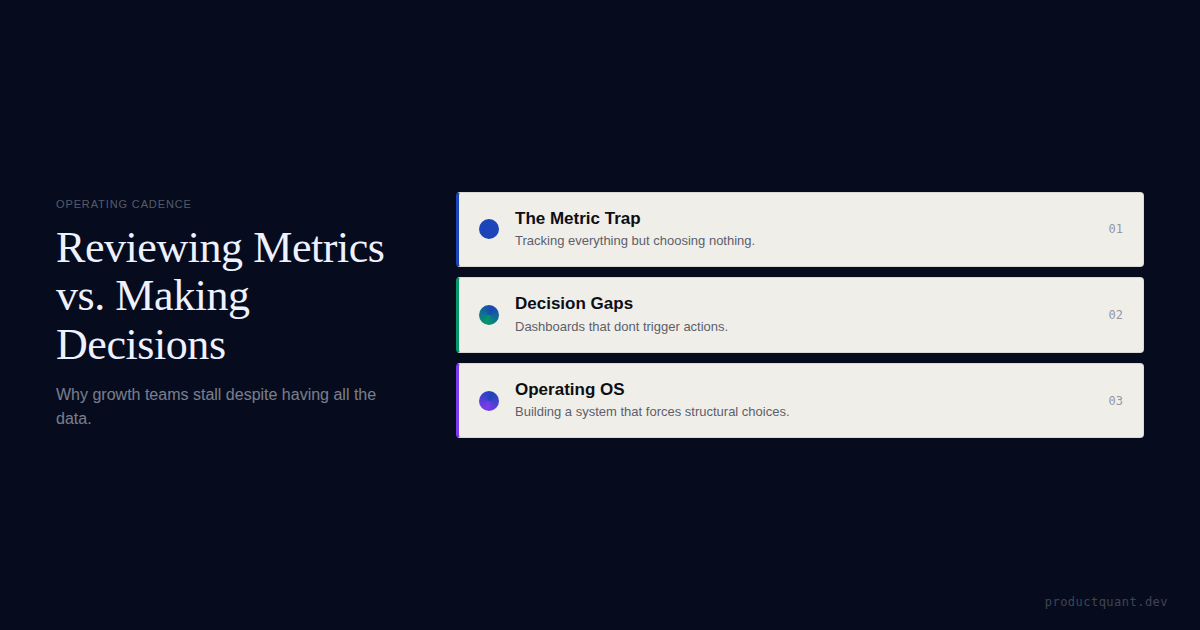
The Dashboard Paralysis Pattern
Here's what it looks like. Your team built a beautiful dashboard. 47 charts. 6 tabs. Real-time data. Cohort breakdowns. Trend lines. Everyone was proud of it.
Three months later, nobody looks at it.
Not because the data is wrong (it isn't). Not because the dashboard is ugly (it's not). Because the dashboard doesn't answer the question anyone actually has.
The CEO wants to know: "Are we on track?" The VP of Sales wants to know: "Which deals are at risk?" The Head of Product wants to know: "Did this release improve activation?" The CSM wants to know: "Which accounts should I call today?"
None of these questions are answered by a dashboard that shows 47 trending metrics.
The 3 Types of Dashboard Charts (And Only One Drives Decisions)
Every chart on your dashboard falls into one of three categories. Understanding which category each chart belongs to is the first step to fixing dashboard paralysis.
Type 1: Vanity Metrics
These charts look important but drive zero decisions:
- Total signups (cumulative — always goes up)
- Monthly active users (always goes up unless something is very wrong)
- Total revenue (same)
- Page views
- Social media followers
These metrics always trend up. They make you feel good. They tell you nothing about whether your business is healthy. A company can have 1 million total signups and be one month from running out of cash.
Type 2: Health Metrics
These charts tell you the current state but don't tell you what to do:
- Activation rate (38%)
- Churn rate (3.1%)
- CAC payback (8 months)
- NRR (105%)
These are useful for monitoring but not for deciding. Knowing your activation rate is 38% doesn't tell you whether 38% is good, whether it changed from last week, or what to do about it.
Type 3: Decision Metrics
These charts answer the question "do we need to act right now?":
- Activation rate by cohort: March cohort at 42%, February at 38%, January at 35% (trend is improving — no action needed)
- Activation rate by cohort: March at 28%, February at 38%, January at 40% (trend is declining — investigate within 48 hours)
- At-risk accounts: 12 accounts with engagement velocity drop >50% in the last 14 days (CSM outreach needed today)
- Experiment results: Variant B shows +15% activation with p < 0.05 (ship it)
Decision metrics have three components the other types don't: a benchmark (what's good), a trend (is it changing), and a trigger (what do we do if it crosses a threshold).
The 5-Metric Framework
Replace your 47-chart dashboard with these 5. Each one has a question, a benchmark, and a trigger. If you can't define all three for a metric, it doesn't belong on your dashboard.
| Metric | Question | Benchmark | Trigger |
|---|---|---|---|
| Activation Rate by Cohort | Are new users reaching value, and is it improving? | Target rate based on retained user data (typically 35–50% for B2B SaaS) | If rate drops below benchmark for 2 consecutive weeks, investigate onboarding |
| Retention Curve by Cohort | Are users who reach value staying? | Flat curve; 60%+ retention at 90 days for activated users | If 30-day retention drops 10+ points from previous cohort, investigate product changes |
| Expansion Revenue by Segment | Are existing customers paying more over time? | NRR >110%; expansion >10% of total revenue | If NRR drops below 105% for 2 consecutive quarters, investigate pricing and CS |
| CAC Payback by Channel | How fast do we recover acquisition cost? | <12 months for B2B SaaS; <6 months for PLG | If payback extends beyond benchmark for any channel, pause or reduce spend |
| At-Risk Account List | Which accounts need intervention this week? | 0 accounts with engagement velocity drop >70% in 14 days | Any account on the list gets CSM outreach within 48 hours |
Five metrics. Five questions. Five triggers. That's all your team needs to make decisions. Everything else is noise.
The average SaaS company tracks 47 metrics on its primary dashboard. The teams that move fastest track 5 — each with a benchmark, a trend, and a trigger. The other 42 metrics don't disappear. They get archived into the "board dashboard" where they belong.
Why Your Current Dashboard Doesn't Work
There are four specific reasons dashboards fail to drive decisions. Each has a specific fix.
It Answers "How Many" Instead of "Why"
"How many signups this week?" → 142. OK, and? "Why did signups drop 20% from last week?" → That's the question that drives a decision.
The fix: Add context to every metric. Not "142 signups" but "142 signups (down 20% from last week, driven by a 40% drop in paid ad signups after we reduced budget)."
It Has No Triggers
A dashboard without triggers is a scoreboard, not a system. Your team looks at it, sees the numbers, and goes back to work. Nothing changes.
The fix: Every metric on your dashboard needs a trigger: "If X drops below Y, we do Z." Agree on the triggers in advance so the dashboard makes the decision for you.
It Shows Averages Instead of Segments
Your overall activation rate is 38%. Sounds fine. But paid ad signups activate at 55% and organic signups activate at 22%. The average hides the problem.
The fix: Every metric should be broken down by at least one segment: signup source, plan type, user role, or cohort. If the segment-level data looks different from the aggregate, the aggregate is lying.
It's Built for the Board, Not for the Team
Board dashboards show trends over quarters. Team dashboards show trends over days and weeks. If your dashboard is optimized for quarterly board reviews, it's useless for weekly team decisions.
The fix: Build two dashboards. One for the board (quarterly trends, high-level metrics, revenue focus). One for the team (weekly trends, input metrics, action triggers).
The board dashboard is a historical record — it proves you're growing. The team dashboard is an operational tool — it tells you what to do today. Confusing the two is the most common dashboard mistake. A board dashboard with 47 charts is fine if the board likes it. A team dashboard with 47 charts is a decision killer.
of dashboard metrics are never acted upon, according to analytics industry studies. The remaining 20% drive 100% of decisions. The goal isn't to eliminate the scoreboard — it's to separate it from the decision system so the team can actually use it.
One more thing: the dashboard you build first will be wrong. That's OK. The 5-metric framework is a starting point, not a prescription. Your benchmarks will be wrong at first. Your triggers will be too sensitive or not sensitive enough. The point is to start with 5 and iterate, not to start with 47 and give up.
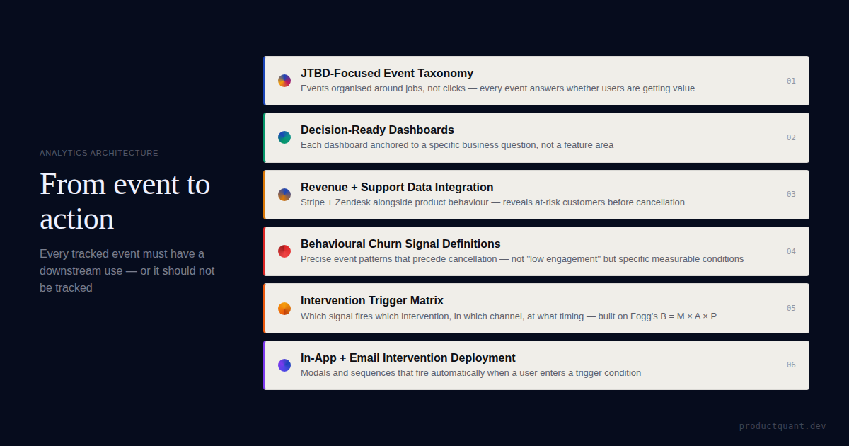
The Decision Map: Turning Metrics into Action
The difference between a dashboard and a decision system is the decision map — a set of "if X happens, we do Y" rules that turn metric movements into action. This is what separates an operating system from a scoreboard.
Example Decision Map Entries
If activation drops: Identify which funnel step had the largest drop. Segment by user type to find where the drop is concentrated. Pick one hypothesis for why this happened. The decision map eliminates the "let's keep an eye on that" meeting that produces nothing.
If NRR drops below 105%: Separate voluntary churn from involuntary churn. If involuntary churn is above 1.5%, fix dunning management before anything else. If voluntary churn is rising, segment by tenure — customers leaving within 90 days have a different problem than customers leaving after 12 months.
If CAC payback extends beyond 12 months: Not all channels are equal. The channel dragging your average down needs to be paused or restructured. Most companies discover that 80% of their CAC waste comes from one channel they've been funding out of habit.
At ProductQuant, we've seen this pattern across dozens of B2B SaaS companies. The teams with the best outcomes don't track more metrics. They track the right metrics with benchmark thresholds that trigger decisions — not debates. The output of a growth operating system is not a dashboard. It is decisions. Every meeting, every review, every experiment readout should end with one of three decisions: ship it, kill it, or iterate.
The Metric Registry
One hidden source of dashboard paralysis is metric disagreement. "Active users" means one thing to engineering, another to marketing, and nobody can tell you the exact definition. The CEO looks at revenue. The PM looks at DAU. The head of product looks at feature adoption. Everyone is looking at a different number, and nobody knows which one matters most.
The fix: Build a metric registry — a single document that defines every metric on your dashboard with its formula, data source, owner, and freshness SLA. If a metric isn't in the registry, it doesn't go on the dashboard. This eliminates the "which number is right?" debate that kills most data-driven meetings.
In our engagements, building the metric registry takes 2 days and eliminates 80% of dashboard-related arguments. The remaining 20% are resolved by the trigger system: if the metric triggers action, it stays. If it doesn't, it goes.
FAQ
How many metrics should a SaaS company track?
5–7 decision metrics with triggers. Not 20+. Not 47. If a metric doesn't have a trigger — a specific action you take when it crosses a threshold — it's a vanity metric masquerading as a decision metric.
What's the difference between a vanity metric and a health metric?
A vanity metric always trends up (total signups, total revenue, total users). It looks important but can't go down unless the company is dying. A health metric can go up or down (activation rate, churn rate, CAC payback) and tells you the current state of your business. Health metrics are necessary but not sufficient — they need triggers to become decision metrics.
Should I delete my current dashboard?
No. But you should add triggers to every metric on it. A metric with a trigger is a decision metric. A metric without a trigger is a scoreboard. Keep the scoreboard if your board likes it. But build a separate decision dashboard for your team.
How do I find the right benchmark for each metric?
Your own historical data. What activation rate do your retained users achieve? What's the floor below which churned users typically fall? Those are your benchmarks. Industry benchmarks are starting points; your data is the truth.
How often should I review my decision dashboard?
Weekly. Each trigger has a built-in cadence: activation rate and at-risk accounts are reviewed weekly. CAC payback and NRR are reviewed monthly. Retention curves are reviewed per cohort release (usually weekly or bi-weekly). The key is that the dashboard tells you when to look — you don't need to check it daily hoping to find something.
What tool should I use to build my decision dashboard?
PostHog, Mixpanel, Amplitude, or even a well-structured Looker dashboard — the tool doesn't matter as much as the structure. Start with whichever analytics platform your team already uses. The bottleneck is never the tool. It's deciding which 5 metrics matter and agreeing on triggers. Once you have that, any dashboard tool can display them.
Sources
- SaaSHero — Best SaaS Analytics Tools — Analytics tool comparison.
- Guideflow — Product Analytics Tools — Comprehensive tool guide.
- Baremetrics — Dashboard Metrics — SaaS dashboard best practices.
- ProductQuant — Growth Metrics That Don't Drive Decisions — The vanity vs decision metric framework.

About the Author
Jake McMahon builds growth infrastructure for B2B SaaS companies — analytics, experimentation, and predictive modeling that turns product data into revenue decisions. He has replaced 47-chart dashboards with 5-metric decision systems across multiple engagements, cutting dashboard review time by 80% while increasing decision velocity. Book a diagnostic call to discuss your analytics infrastructure.
Related Reading

Get an Analytics Audit
We'll assess your current dashboards, tell you which metrics drive decisions and which don't, and build the 5-metric system your team will actually use.