TL;DR
- Product analytics ROI is not just reporting quality. It shows up in faster answers, clearer activation and retention levers, recovered revenue, and lower analytics waste.
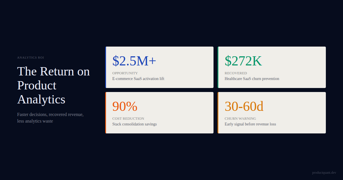
- In one healthcare SaaS case, analytics work identified $272K-$505K annual impact , reduced analytics cost by 90% , and gave CS a 30-60 day churn-warning window.
- In one e-commerce SaaS case, analytics gaps hid $2.5M+ in annual opportunity because the team could not see feature discovery, activation drop-off, or retention-linked behavior.
- The right ROI calculator is not vendor-led. It maps decision-speed savings, activation lift, retention saves, revenue visibility, and tooling cost change.
Most companies justify analytics tools the wrong way. They compare software cost to software cost, or they compare tool features in a checklist. That misses the actual economic question.
The real question is: what becomes possible once the team can see the behaviors that actually drive activation, retention, expansion, and churn?
That is why the return often shows up indirectly first. Decision latency drops. Experiments stop running on weak proxy metrics. Customer success intervenes earlier.
Product sees which features actually predict retention. Finance and product stop arguing from disconnected numbers. The dashboard is just the visible surface of those changes.
The insight: triple-digit returns and rapid value realization are baseline outcomes from analytics investments, not exceptions. The question is not whether analytics delivers ROI. The question is whether your team is measuring the right things to see it.
of technology implementations achieved more than 100% ROI, with 70% reaching full payback in under 6 months. (Nucleus Research, 128 case studies, 2021-2025)
The same research found that companies leveraging analytics to drive decision-making gain benefits in 3 primary areas: reduced costs, increased productivity, and new business opportunities. Cost reduction accounts for more than one-third of the total value from an analytics implementation. Productivity gains — from reducing the time to make decisions — account for 10 to 20 % of the benefits. And in many cases, analytics helped uncover new business opportunities that drove revenue growth and increased market share.
Nucleus Research analyzed 128 case studies published between 2021 and 2025 to identify patterns in how organizations generate measurable financial returns from technology investments. The data is clear: 87.9 % of implementations achieved more than 100 % ROI, with 64.7 % exceeding 200 % annual ROI. These initiatives also deliver value quickly, with 70 % reaching full payback in under 6 months.
What the Research Shows About Analytics ROI
What The ROI Looked Like In Practice

The pattern is easiest to see in real implementations rather than abstract theory.
1. Healthcare SaaS: from unusable data to decision-ready infrastructure
One healthcare SaaS platform had events firing, but 0% of the captured data was usable for segmentation or growth analysis. The problem was not the tool — it was what the tool was tracking.
What specifically was wrong: the event taxonomy was built around the UI, not the business questions. Every button click fired a separate event. No grouping, no hierarchy. The team had 2,400+ distinct event types and none of them answered "did this customer activate?"
After the rebuild, the system changed in four ways that matter economically:
- Cost reduction: analytics infrastructure dropped by roughly 90% , moving to a compliant stack at around $450/month instead of enterprise-tool overhead.
- Decision visibility: 118+ decision-ready charts were built question-first, across activation, feature adoption, and churn signals.
- Retention intervention: the CS team began receiving a weekly at-risk list 30-60 days before cancellation instead of learning from a renewal spreadsheet after the fact.
- Business impact: the diagnostic alone identified roughly $272K-$505K annual impact .
How the infrastructure was rebuilt: the team started with 12 business questions — not 2,400 events. Each question mapped to 2-3 events maximum. The event taxonomy went from 2,400+ events to 47 tracked events that actually answered the questions the business argued about.
The charts were not an output. They were the answer key.
This is what good analytics ROI looks like. Not prettier reporting. Lower cost, earlier intervention, and a clear map between behavior and revenue.
2. E-commerce SaaS: revenue hidden behind measurement gaps
In another case, activation was stuck at 20% , but the team could not tell why. The funnel had coverage only on the first few steps. More than 40 critical events were missing.
Where the gaps were: the team could see signups and they could see billing. But everything between signup and first value was invisible. The onboarding flow had 7 steps and the analytics only covered the first 2 . The drop-off was happening in steps 3-6 — and nobody could see which one.
The highest-value feature in the product was discovered by only 13% of users, even though the users who found it retained at roughly 1.8x the rate. That is exactly the kind of pattern weak analytics systems miss. The team had been optimizing step 2 for months. The real leak was step 4.
How the gaps were found: a tracking plan audit against the business questions revealed that 6 of the 12 core questions had zero event coverage. The missing events were not complex — they were basic navigation and interaction events that should have been firing from day one. The team had simply never validated that the events they needed existed.
Once the event taxonomy and discovery path were rebuilt, the economics became clearer:
- Activation improved from 20% to 35%
- Feature discovery moved toward 40%+
- The team could quantify more than $2.5M annual opportunity across activation, discovery, and retention-linked gaps
The ROI here was not only the improved activation rate. It was the ability to see which blind spots were suppressing revenue in the first place.
3. Healthcare forms platform: segment-specific onboarding instead of one blended view
A third implementation made a different kind of return visible. The core issue was not missing dashboards alone. It was that multiple user types were being pushed through the same experience, even though enterprise users churned at around 3x the rate of solo practitioners.
What segment-specific patterns were discovered: the blended dashboard showed "activation is fine" because solo practitioners were activating at 65% and enterprise users at 18% . Averaged together, it looked like a 42% activation rate — acceptable but improvable. But the $2M enterprise segment was hemorrhaging and nobody could see it because the solo practitioner volume was masking the enterprise churn signal.
Once the analytics layer separated those paths, the team could stop treating the onboarding problem as generic. Enterprise users had a fundamentally different activation path — they needed team setup, permission configuration, and compliance sign-off before they reached value. Solo practitioners needed to complete one form. The same onboarding flow was actively hostile to one group while serving the other.
The measurable effect was a combination of lower analytics cost, more relevant dashboards, and materially better retention behavior for the segment that had been mishandled. The ROI was not the dashboard. It was seeing that one segment was subsidizing the visibility of another.
That is another form of analytics ROI teams often miss: segment truth . A blended dashboard can hide where the real value destruction is happening.
Use the ROI calculator template
This CSV is spreadsheet-ready. Plug in your current analyst queue, reporting hours, activation lift assumptions, retention saves, and stack cost to estimate where product analytics would actually pay back.
Where The Return Actually Comes From

Across implementations, the return usually comes from five sources.
| ROI source | What changes | Why it matters |
|---|---|---|
| Decision speed | Analyst queues and manual exports shrink | Teams get same-day answers instead of waiting days for basic questions |
| Activation clarity | Drop-off and value moments become measurable | Onboarding and experiment work stops optimizing the wrong step |
| Retention visibility | Early risk signals appear before cancellation | CS can intervene proactively rather than report loss after the fact |
| Revenue linkage | Usage and billing data connect | Teams can see which features predict upgrade, contraction, or nothing |
| Stack efficiency | Bad tooling and wasted implementation work get exposed | Cost drops while coverage and decision quality improve |
This is why "analytics ROI" should not be treated as one number. It is a stack of returns. Some are direct cost changes.
Some are revenue opportunities. Some are avoided waste because the team stops building around a false metric.
"The best product analytics don't just measure what users do. They reveal why the business model works or doesn't."
— Amplitude, The State of Product Analytics 2025
If a team moves from a 3-5 day analyst queue to same-day self-serve answers, that is not just a workflow improvement. It changes how quickly experiments, fixes, and customer interventions can happen.
The ROI Calculator Framework
The right way to calculate analytics ROI is not with vendor benchmarks. It is with your own numbers. The calculator we use maps five dimensions:
- Decision-speed savings: how many analyst hours per week are spent answering questions that a proper analytics system would answer instantly? Multiply by loaded analyst cost.
- Activation lift: if analytics reveals one drop-off point that, when fixed, improves activation by even 5% , what is the annual LTV of those additional activated users?
- Retention saves: if the CS team gets a 30-day churn warning window and can save even 2-3 accounts per quarter, what is the recovered ARR?
- Revenue visibility: what revenue opportunities are invisible because usage and billing data never meet? The e-commerce case above found $2.5M .
- Stack cost change: what is the difference between your current analytics overhead (tools, implementation, maintenance) and a right-sized system?
Each dimension is a fill-in variable. The spreadsheet-ready CSV calculator linked below does the math. The point is not to produce a single ROI number. The point is to surface which dimension is the biggest lever for your specific situation.
What External Research Says About Analytics ROI
There is broad external validation for the economic case. Nucleus Research analyzed 128 technology ROI case studies and found that analytics-driven organizations benefit in three measurable areas: reduced operational costs, increased analyst productivity, and new business enabled by data-driven decisions. McKinsey's research on decision quality similarly shows that organizations with high-quality analytics processes make better decisions faster — and that the economic gap between high and low decision-quality organizations compounds over time.
The pattern is consistent: analytics ROI is rarely in the tool itself. It is in what the tool enables the team to stop doing wrong and start doing right.
How Companies Measure ROI Wrong
Most ROI cases fail because they count the wrong benefits or trust the wrong baseline.
They compare tool cost, not operating change
If the argument is just "PostHog costs less than Amplitude" or "our current tool is expensive," the business case stays shallow. The stronger case is what the system lets the team do after the rebuild.
They count dashboards instead of decisions
Dashboard count is not ROI. Decision quality is. A smaller set of dashboards that answers real operating questions is worth more than a large unused reporting surface.
They treat activation, retention, and revenue as separate analytics domains
This is a common failure. If product usage, billing, and success signals never meet, the business can only tell partial stories. The highest-return analytics implementations usually connect those layers.
They use fabricated benchmark math
The right move is not to invent a generic "analytics improves activation by 18%" claim. It is to map the actual levers that are currently invisible in your own system and quantify those. That is why the calculator template is built around fill-in variables, not fake industry averages.
How to Calculate Product Analytics ROI for Your Company
The ROI from product analytics is not the cost of the tool. It is the value of the decisions that change because the team has better evidence. Here is the framework ProductQuant uses with clients.
Step 1: Map the decision categories
Every product team makes decisions in 4 categories: activation improvements, retention interventions, feature prioritization, and pricing changes. For each category, estimate the current cost of a wrong decision. A misprioritized feature cycle costs 2 to 3 engineering sprints. A retention intervention that misses the right segment wastes 4 to 6 weeks of customer success time.
Step 2: Estimate the decision improvement rate
Product analytics does not eliminate wrong decisions. It reduces the frequency. A reasonable estimate is that evidence-based teams make 20 to 30 % fewer wrong decisions per quarter than teams operating from intuition alone.
Step 3: Calculate the annual return
The formula is simple: (cost of wrong decisions × improvement rate × decisions per year) minus (tool cost + implementation cost) . For a team that makes 20 product decisions per quarter, where the average wrong decision costs $25,000 in wasted engineering time, a 25 % improvement rate saves $125,000 per quarter — $500,000 annually. Against a tool cost of $50,000 and implementation cost of $25,000 , that is an ROI of 667 %.
| Decision Category | Cost of Wrong Decision | Decisions per Quarter | Annual Savings at 25% Improvement |
|---|---|---|---|
| Feature prioritization | $50,000 (2-3 sprints) | 8 | $100,000 |
| Retention interventions | $30,000 (4-6 weeks CS time) | 4 | $30,000 |
| Activation improvements | $75,000 (missed conversion) | 3 | $56,250 |
| Pricing changes | $200,000 (revenue impact) | 2 | $100,000 |
The insight: the real cost of product analytics is not the tool license. It is the organizational change required to act on what the data reveals. Teams that build the decision system alongside the measurement system see returns that compound quarter over quarter.
The ROI gets much stronger when dashboards are tied to decisions
The best analytics work does not stop at instrumentation. It also changes the review cadence, decision rules, and ownership around the metrics.
How Companies Measure Analytics ROI Wrong
The most common mistake is measuring analytics ROI by dashboard usage. A team that monitors 20 dashboards daily but changes zero decisions has not generated any return. The dashboard is the measurement system. The decision is the return.
Another common error is attributing all product improvements to the analytics tool. If activation improved by 15 % after implementing product analytics, the improvement came from the changes the team made — not from the tool itself. The tool's contribution is the evidence that led to those changes. Separating the two is important for honest ROI calculation.
McKinsey's research on decision quality emphasizes that the value of analytics comes from improving the quality of the decision-making process, not from the volume of data available. Teams that add more dashboards without improving their decision cadence are building a library, not a decision system.
The insight: a dashboard that doesn't change a decision is just expensive decoration. ROI comes from action, not visibility.
FAQ
Can product analytics ROI be justified before a full implementation?
Yes, directionally. That is what the audit phase is for. You identify the biggest blind spots, estimate the addressable opportunity, and decide whether the next implementation step is worth it.
What is the fastest ROI signal to look for?
Usually one of these: a major activation blind spot, missing feature discovery on a high-retention feature, or no connection between usage and revenue events. Those three tend to create material visibility quickly.
What if the team already has dashboards?
That does not mean the ROI case is gone. Many teams have dashboards that answer setup-phase questions but not the questions the business argues about today. The return often comes from rebuilding around current decisions, not adding more charts.
Should the calculator include soft benefits too?
Use soft benefits as supporting context, not the core case. Lead with measurable changes: time saved, revenue identified, accounts saved, or stack cost reduced.
Sources
- Nucleus Research — ROI Reality Check: 128 case studies, 87.9% achieved 100%+ ROI, 70% payback in under 6 months
- Nucleus Research — The ROI of Analytics: cost reduction (1/3 of value), productivity gains (10-20%), new business opportunities
- McKinsey — Fostering Better Decisions Through ROI Estimates: decision quality factors beyond NPV
- Data-Driven Decision-Making: Leveraging Analytics for Product Management (ResearchGate)

About the Author
Jake McMahon writes about analytics infrastructure, Product DNA, and the operating systems behind activation, retention, and expansion. ProductQuant helps B2B SaaS teams rebuild measurement around the decisions that actually move revenue.
Related reading
If the analytics cost is obvious but the revenue loss is invisible, that is the problem.
The audit exists to find the blind spots worth more than their fix, so the ROI case is built from your own growth system instead of vendor math.