TL;DR
- Churn prediction is not a dashboard — it's a weekly list. The output is a ranked account list in your CS team's inbox every Monday, not a chart someone has to interpret.
- The right signals are behavioral, not survey-based. Login frequency dropping 70% from a user's own baseline predicts churn better than any NPS score. Usage slope matters more than usage level.
- Most production models land at 0.75-0.85 AUC with 10-15 derived features. You don't need 300 variables. You need the right 10-15, engineered from your actual product data.
- Flagging 60% of churners 6 weeks out beats flagging 90% three days out. Early detection only matters if there's time to intervene.
- AI plus human intervention prevents up to 71% of predicted churn. But only 23% of customer success teams currently use AI for prediction.
- In one engagement, we built a churn model at 0.82 AUC from 25+ behavioral features — and the same data layer revealed a 3x LTV segment and drove a 75% activation improvement.
The Cancellation Button Is a Lagging Indicator

By the time the dashboard spikes, the customer has already been gone for weeks.
By the time someone clicks cancel, fills out the exit survey, or tells their CSM they're "exploring alternatives," the decision was made weeks or months ago. The behavioral signals were there. Nobody was tracking the right ones.
Most SaaS teams try to predict churn using the wrong inputs: NPS scores that measure sentiment about a recent interaction, not intent to leave. Exit surveys from people who already decided to leave, telling you why, after it's too late. Absolute usage levels that look fine until you realize a user who logs in 5 times per week used to log in 15 times. Renewal proximity that tells you a contract expires in 30 days — which is not prediction, it's a calendar.
The cancellation button is the last thing that happens. The first signals appear in the product data, weeks before anyone knows they're looking at them.
Here's how we actually build churn prediction systems inside B2B SaaS products.
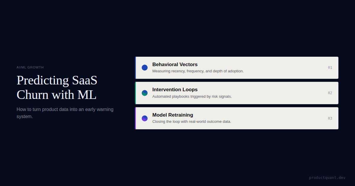
The Signals We Track (And Why Most Teams Track the Wrong Ones)
Churn signals fall into 3 categories. Most teams track one. You need all three.
Frequency Signals — Is Engagement Dropping?
Not absolute frequency. Velocity relative to the user's own baseline. A customer who logs in twice a week has always logged in twice a week — that's stable. A customer who logged in every day and now logs in twice a week — that's a 70% decline in engagement velocity, and it's one of the strongest churn predictors we see in production.
What we instrument: week-over-week login change (trend relative to individual baseline, not the fleet average). Time since last meaningful action (not "last login" — the last action that indicates actual value receipt). Response latency (how long between when we send something and when they engage with it).
The insight: Engagement velocity matters more than engagement level. A declining user is more predictable than an inactive user.
Depth Signals — Are They Using the Product the Same Way?
When customers start churning, they don't just use the product less — they use it differently. Session depth ratio compared to their historical average reveals whether they're skimming the surface instead of going deep. Feature regression — moving from advanced features back to basic ones — shows a power user quietly testing what life without your product looks like. Core workflow completion rate tells you whether they're completing the value workflow end-to-end or abandoning midway.
The insight: Regression from advanced to basic features is often the first visible signal — and it appears 4-8 weeks before any conversation about cancellation.
Breadth Signals — How Many Parts of the Product Do They Still Touch?
Sticky products have users who touch multiple surfaces. Churning users contract. The ratio of distinct features used in the last 14 days vs. first 30 days tells you whether they're expanding or contracting. Seat reduction is a leading indicator of full cancellation. Cross-functional usage shows whether multiple teams are still using the product or it's become a single-department tool.
The insight: Users who don't engage with core features in their first 30 days are 60% more likely to churn. But the inverse is equally true: users who engaged with 3+ features and now use only 1 are already halfway out the door.
The Support Signal Nobody Talks About
Support tickets are counterintuitive as churn predictors. A customer submitting support tickets is investing in the relationship. They want the product to work.
The dangerous patterns are: repeated tickets on the same issue (they asked once, it wasn't resolved, they asked again — the third time, they stop asking). Escalating emotional tone in ticket language. And sudden cessation of tickets — the customer who used to file tickets monthly and just stopped. They didn't solve the problem. They stopped caring enough to report it.
Support metrics frequently outperform NPS as churn predictors because they measure revealed behavior (what people actually do) rather than declared sentiment (what people say they feel).
The insight: A customer who stops filing tickets hasn't solved their problem — they've stopped caring enough to report it. Silence is a stronger churn signal than frustration.
How the Model Actually Works
None of this is theoretical. Here's what ships to production.
Let me be specific about the architecture. This is not a Python tutorial — it's what we actually deploy.
Algorithm Choice
Gradient-boosted decision trees — XGBoost or LightGBM — are the workhorse for churn prediction in B2B SaaS. They handle non-linear relationships, handle noise well, produce feature importance rankings, and stay interpretable enough that a CS leader will actually trust the flags.
For production churn prediction with 10-15 features, gradient boosting hits the sweet spot of accuracy, speed, and explainability.
The insight: You don't need a neural network. Gradient-boosted trees handle noisy product data, rank feature importance, and stay explainable enough that a CS leader will actually trust the flags.
Feature Engineering
The model is only as good as the features you feed it. The most common mistake is using raw counts instead of derived metrics.
| Raw Feature (weak) | Derived Feature (strong) |
|---|---|
| Total logins this month | Week-over-week login change rate |
| Total sessions | Session depth ratio vs. personal baseline |
| Number of features used | Feature breadth contraction (14-day vs. 30-day) |
| Support tickets filed | Ticket resolution rate + escalation severity |
| Days since signup | Tenure-adjusted risk (first 3-6 months = highest risk window) |
The insight: Raw counts are noise. The signal lives in the derived metrics — rate of change, ratio to personal baseline, and tenure-adjusted windows.

The optimal model uses 10-15 high-signal derived features. Not 300. Not 50. 10 to 15, each engineered to capture a specific behavioral pattern that correlates with churn in your product.
Tenure is consistently the strongest predictor — the highest churn risk window is the first 3-6 months, and the probability of churn declines as tenure increases.
Expected Accuracy
Production churn prediction models in B2B SaaS typically land at 0.75-0.85 AUC. In one of our engagements, we built a model at 0.82 AUC from 25+ behavioral features. Academic studies have achieved over 90% accuracy with under 10% false negatives on SaaS-specific datasets.
Flagging 60% of future churners 6 weeks in advance is more valuable than flagging 90% three days before cancellation. The model isn't optimized for maximum precision. It's optimized for early actionability.
The insight: Don't chase 0.95 AUC. A model at 0.80 that flags accounts 6 weeks early saves more revenue than a model at 0.92 that flags them the day they cancel.
In one engagement, the same data layer that powered the churn model also revealed a 3x LTV segment and drove a 75% activation improvement.
"The companies that win at retention don't have better models. They have better data, faster intervention loops, and CSMs who actually act on the flags every single week."
— Atticus Li, Churn Prediction Models: Reading Behavioral Signals
What the Output Actually Looks Like
It's not a dashboard. It's a list. Every Monday morning, the CS team gets a ranked account list with churn probability, the primary signal that drove the flag, and the recommended playbook step. Not a health score dashboard that someone has to check. The difference between "your CS team has a dashboard" and "your CS team has a Monday morning list" is the difference between data sitting somewhere and action happening every week.
Prediction Without Intervention Is Just a Number
The model flags accounts. Then what? This is where most churn prediction projects fail — the scores sit in a dashboard, and nothing changes. The intervention loop is what makes prediction valuable.
Here's the loop we build: model flags an account on Monday morning. The CSM receives the signal plus a recommended playbook step matched to the churn archetype.
The CSM executes the intervention — call, email, usage review, or executive outreach, specific to the signal. The outcome is logged (saved, lost, or deferred) and becomes training data for the next model iteration. The model retrains monthly, incorporating intervention outcomes — the system learns which signals predict actual churn vs. false alarms.

AI paired with human intervention prevents up to 71% of predicted churn. But the human intervention part is not optional. The model tells you who's at risk. The playbook tells you what to do about it. Both have to exist for either of them to matter.
Salesforce's churn system flagged at-risk accounts 6 months before renewal — preserving hundreds of millions in revenue. Gainsight reports 95% renewal forecast accuracy and a 25% reduction in manual CS workload.
Not Sure Which Signals Matter for Your Product?
Every SaaS product has different behavioral patterns. We'll identify the top 3 signals that predict churn in your specific product, before building anything.
Get Your Monday Morning At-Risk List
We build churn prediction models from your behavioral data — with weekly at-risk lists, intervention playbooks, and monthly retraining loops.
The Data Layer Pays for Itself
Here's the thing most teams don't expect: the behavioral data you instrument for churn prediction turns out to be useful for everything else. In one engagement, the same data layer that powered the churn model also revealed a 3x LTV segment, drove a 75% activation improvement, and identified expansion opportunities — accounts using 6+ features had 4x the expansion rate of accounts using 3 or fewer.
You don't build the churn model to save accounts. You build it to understand your product well enough that saving accounts becomes one of many things you can do with the data.
Most Teams Don't Need ML. They Need Better Data.
Before you build a churn prediction model, ask whether you have 6+ months of behavioral event data. If not, you don't need a model — you need instrumentation.
Most teams track pageviews, not actions. You can't predict churn without the right events. And ask whether you know your activation event. If you don't know what action predicts 90-day retention, your churn model is fitting to noise. The model is the last layer, not the first.
FAQ
How much data do you need to build a churn prediction model?
Minimum 6 months of behavioral event data with labeled churn outcomes. More is better. But you don't need Salesforce-scale to start. A model on 6 months of clean event data outperforms intuition on 3 years of CRM notes.
What accuracy should you expect?
0.75-0.85 AUC is the typical range for production B2B SaaS models. The question isn't whether the model is "right" — it's whether flagging 60% of churners 6 weeks early creates more value than waiting.
Which algorithm is best for SaaS churn prediction?
Gradient-boosted decision trees (XGBoost or LightGBM) are the practical choice for most B2B SaaS companies. They balance accuracy, speed, and interpretability. Logistic regression works as a starting point. Neural networks are overkill unless you're processing millions of user records.
How do you know if churn prediction is worth building vs. buying?
If you have a customer success platform (Gainsight, ChurnZero, Totango), it likely has built-in churn scoring. The question is whether its scoring is specific to your product's behavioral patterns or based on generic SaaS benchmarks. Custom models win when your product has unique signals that off-the-shelf platforms can't capture.
What happens when the model gets it wrong?
False positives cost CSM time. False negatives cost revenue. Most teams should optimize for recall over precision — catching more potential churners, even if some are false alarms, is cheaper than missing churners entirely. The model improves monthly as intervention outcomes become training data.
Sources
- Atticus Li: Churn Prediction Models — Reading Behavioral Signals
- Banyan AI: SaaS Churn Metrics & How to Reduce Churn
- Lucid: How SaaS Startups Use AI to Predict Churn
- Velaris: Churn Prediction Models — What They Are and How to Build Them
- Emerald: Churn Prediction for SaaS Company with Machine Learning

About the Author
Jake McMahon builds growth infrastructure for B2B SaaS companies — analytics, experimentation, and predictive modeling that turns product data into revenue decisions. He's built churn prediction models at 0.82 AUC, identified 3x LTV segments from behavioral data, and designed intervention playbooks that save accounts before they cancel. Book a diagnostic call to discuss your product's churn signals.
Get a Churn Prediction Audit
We'll assess your behavioral data, identify your strongest churn signals, and tell you whether a custom model or platform scoring is the right path.