TL;DR
- Product usage data is one of the best internal sources of competitive intelligence. It shows which jobs, feature patterns, and workflows customers value enough to keep using.
- Your wrong-fit customers are often visible in the usage data long before they show up in a strategy deck. In one anonymized analysis, the communication-heavy segment retained at just 7.2%, which changed the positioning question entirely.
- Power users reveal where the moat might be. In the same source set, the top 10% of customers drove 86-94% of total usage, making them the clearest place to study durable value patterns.
- Correlation is still useful even when it is not causation. Retention-linked usage patterns can tell you what to investigate, message, or test next without pretending the answer is already proven.
- The strongest method is triangulation. Usage data gets sharper when paired with JTBD, Kano, segment research, and competitive analysis rather than used in isolation.
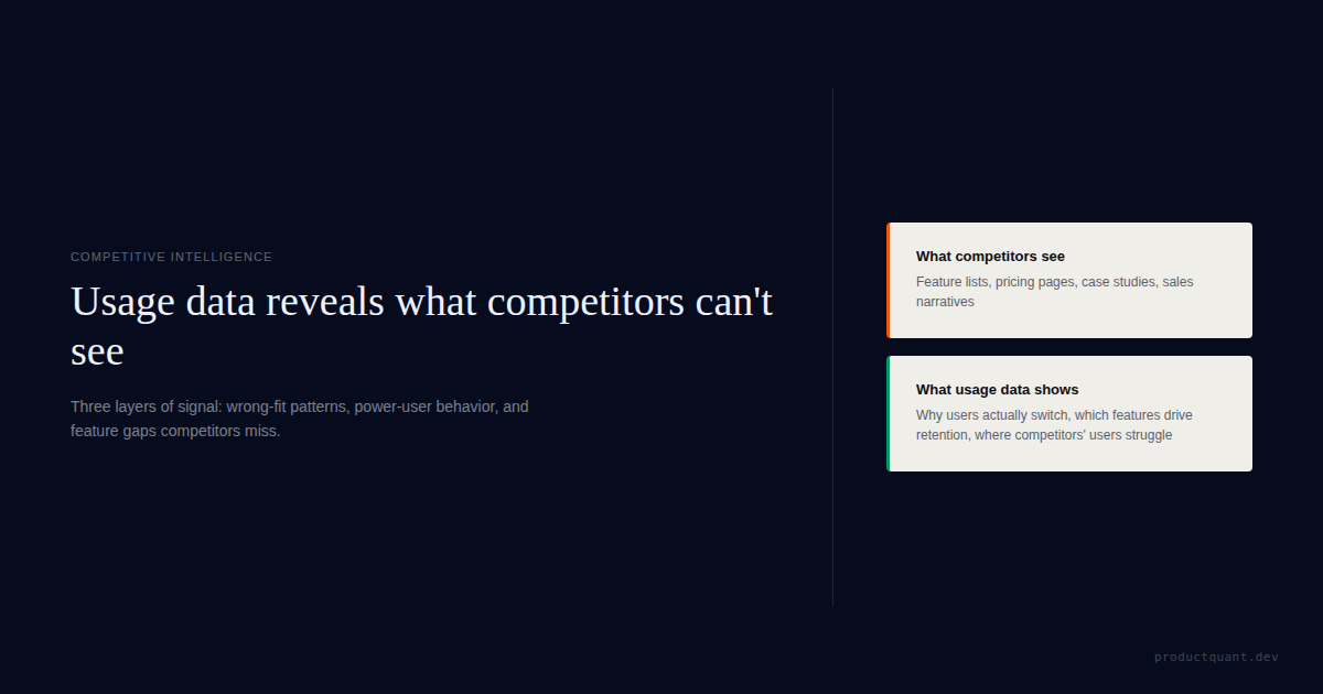
Most competitive intelligence starts outside the product. Teams compare pricing pages, feature lists, messaging, review sites, and category narratives. All of that matters. But it often misses a more important source of truth: what your own customers actually do when the product becomes part of their workflow.
A competitor spreadsheet can tell you who claims to have EHR integrations, automation, AI, or enterprise controls. It cannot tell you which jobs your retained customers actually care about, which features separate power users from everyone else, or which segments are quietly churning because your positioning attracted the wrong kind of buyer.
That is why product usage data matters strategically. Not because it replaces market research, but because it shows where value is real enough to survive inside the product. That makes it one of the best internal inputs for positioning, roadmap focus, onboarding design, and segment selection.
What Usage Data Can Show That Competitor Matrices Cannot

Usage data is strongest when you ask 4 competitive questions.
- Which jobs create durable customers?
- Which jobs attract weak-fit customers?
- Which feature patterns correlate with deeper workflow embedding?
- Which "unique" features are actually used by valuable segments?
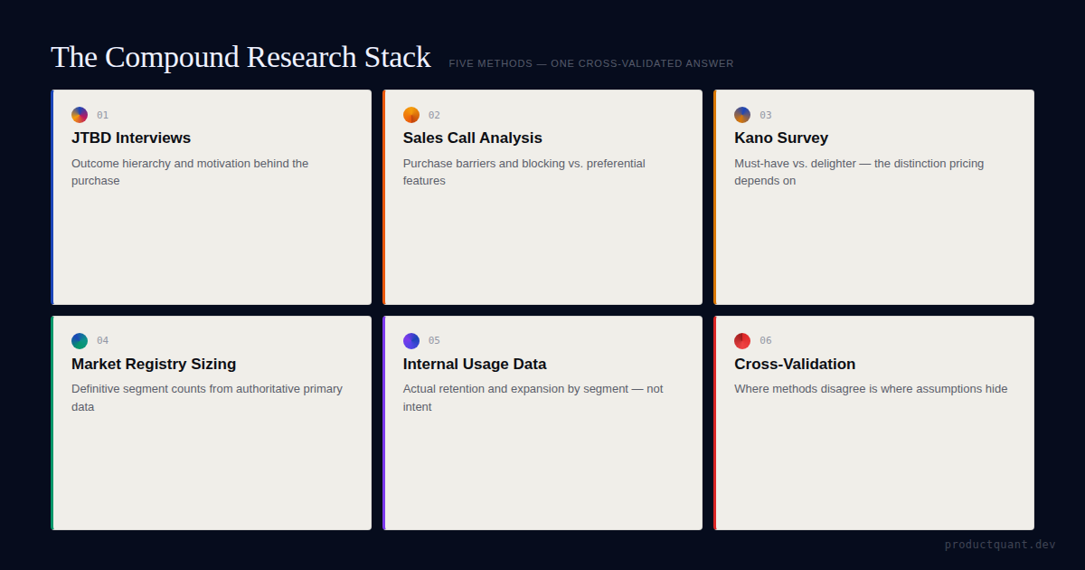
One anonymized strategic analysis for a HIPAA-compliant healthcare SaaS platform combined 2,690 real customer accounts, 60 sales conversations, 40+ Kano-classified features, 35 competitors, and 4 UX reviews. That did something competitor analysis alone could not. It showed what feature usage actually meant once you added customer jobs, feature classification, and external market context.
The strategic advantage was not one dataset. It was the triangulation: customer-job analysis, cleaned usage data, Kano-style feature classification, and explicit competitor comparison all pointing at what the product actually meant to different segments.
This is the core competitive-intelligence move. Instead of asking only "what do competitors offer?" you ask "which jobs, workflows, and feature meanings survive when real customer behavior and market comparison are forced into the same frame?"
Pattern 1: Wrong-Fit Demand Shows Up in Usage Before It Shows Up in Positioning
One of the most valuable things usage data can do is tell you who should probably not be the center of your positioning. But that only works when usage is checked against the rest of the research stack.
In the healthcare SaaS work, the flagship integration feature looked central in the team's story. The triangulated analysis said something narrower: it was a deal-breaker for only 13% of prospects overall, while two-thirds of the pipeline wanted a simpler, faster implementation path.
That is a strategic signal. It means the team was at risk of over-positioning around a feature that mattered enormously to one slice of the market, but not to the whole revenue base. In other words, the issue was not feature importance in the abstract. It was segment-specific importance.
This matters competitively because weak-fit demand can distort both roadmap and messaging. The team sees loud demand for one capability and assumes that is the obvious wedge. But the full research stack says something else: some jobs are core, some are segment-critical, and some belong in a narrower sales track instead of the headline position.
Pattern 2: Power Users Reveal the Shape of the Moat
Power-user behavior is not just a success metric. It is moat intelligence. In the same source set, the top 10% of customers accounted for 86-94% of total feature usage. That concentration is extreme, but useful.
When usage is that concentrated, the right question is not "how do we make everyone look like the power users?" The better question is "what workflow, segment, or job pattern makes these users worth studying so closely?"
That analysis pointed toward a set of stronger jobs: workflow completion, data export, confidence, and embedded operational value. The product stopped looking like a generic form builder and started looking like infrastructure inside a healthcare workflow.
"Your moat is rarely visible in your average user. It is usually visible in the users who have turned the product into part of how work gets done."
— Jake McMahon, ProductQuant
This is where usage data becomes competitive positioning. If your deepest users are not using the product the way your homepage describes it, the homepage is wrong. And if your deepest users rely on one workflow that competitors make harder, slower, or riskier, that workflow is where the moat probably lives.
Pattern 3: The Real Question Is Not "Is This Feature Unique?" but "What Does This Feature Mean?"
Teams often overvalue uniqueness. They find a feature no competitor has and assume that feature is the moat. The better question is what that feature means to different segments once jobs, usage, and market context are combined.
In the healthcare SaaS source material, the strategic read came from classification, not novelty alone. The work surfaced 2 features that zero of 35 competitors offered. That was useful, but it was not the whole answer. The more important result was understanding which features were Must-Haves, which created pricing power, which were weak Delighters, and which only mattered inside one high-value segment.
That distinction showed up clearly in two places. White-glove onboarding produced a 5x willingness-to-pay increase and appeared in 55% of closed-won deals, but the same thing damaged trust with technical buyers because it signaled that the product might be hard to use. And a niche integration mentioned in only 8% of calls was a 100% deal-breaker in the highest-value contracts.
This is why aggregate adoption is not enough. A feature can look small in the total base and still be strategically decisive in the contracts that matter most. Another feature can look rare and still deserve less commercial emphasis because it does not anchor retained workflows or meaningful willingness to pay.
That is what good competitive intelligence sounds like. Not "this feature is unique, therefore it is the moat," but "this feature is table stakes here, segment-critical there, and weakly differentiating everywhere else." The difference is strategic, not cosmetic.
Pattern 4: The Strongest Read Comes From Triangulating Usage with JTBD and Kano
Usage data on its own is incomplete. It shows behavior. It does not fully explain intention or feature meaning. That is why the best competitive read comes from combining it with customer-job analysis, feature classification, and explicit market comparison.

That was the main thing about the work here. We did not use usage data as a standalone competitive shortcut. We triangulated JTBD, Kano, usage data, competitor research, and product-DNA-style differentiation analysis to understand what features actually meant to users.
In practice, that combination changed the output. JTBD-style analysis showed which jobs dominated the customer base. Kano-style work showed which features behaved like Must-Haves, Delighters, or segment-specific deal-breakers. Usage data showed which workflows repeated inside retained accounts. Competitive comparison showed which differentiators were genuinely rare, which were already decaying, and which competitor claims fell apart under inspection.
That is a much better system than any one method alone. Usage tells you what is happening. JTBD helps explain what problem the customer thinks they hired the product for. Kano helps classify which features create table stakes, upgrade pressure, or moat. Competitor analysis adds the external reference layer.
If your positioning is not grounded in retained usage patterns, it will drift toward whatever sounds strongest in the market this quarter
The faster win is usually to study the workflows and jobs your best customers actually repeat, then check those patterns against feature classification and competitor reality before sharpening the message.
This is also why Kano thinking matters here. If a feature is rare but low-impact, it may be a weak Delighter. If it is segment-critical and tied to retained workflows, it may be part of the moat. The difference is strategic, not cosmetic.
How to Turn Usage Data Into Competitive Intelligence

Use this 5-step sequence.
1. Segment users by job or workflow pattern
Do not stop at company size or plan tier. Segment by what customers are trying to accomplish in the product. That is where wrong-fit demand and sticky usage patterns become visible.
2. Compare retention, intensity, and progression by segment
Which groups retain? Which groups deepen usage? Which groups never get past the first few steps? This is where positioning and onboarding questions start to separate.
3. Inspect the top 10% of users closely
Look at their adoption sequence, feature combinations, and job pattern. They often reveal the workflow that competitors would have to break in order to displace you.
4. Cross-check "unique" features against actual usage
If the feature is rare but not used by retained customers, it may not be a moat. If it appears in high-value segments or deep workflows, it deserves strategic focus. Uniqueness without meaningful adoption is weak evidence.
5. Translate the insight into positioning, not just product notes
The point is not only to find a better feature backlog. The point is to clarify which customers to attract, which value prop to lead with, which segments to downplay, and which workflows deserve commercial emphasis.
The Methodology Caution You Cannot Skip
Usage data is powerful, but it is easy to abuse. A strong retention correlation does not prove a feature causes retention. A power-user cluster does not automatically define the whole ICP. A small-sample segment can hint at a truth without proving it.
The source material behind this article was unusually explicit about that. Several retention-linked export findings came with direct warnings about selection bias, reverse causation, and small sample sizes. That does not make the analysis weak. It makes it honest.
The right use of usage-based competitive intelligence is to identify what deserves deeper research, stronger positioning, or experimental validation next. It should sharpen judgment, not replace it.
FAQ
Can product usage data replace competitor research?
No. Usage data is strongest when paired with customer research, segmentation work, and competitor analysis. It tells you what your customers actually do, not everything rivals are changing in the market.
What is the most useful competitive signal in usage data?
One of the strongest signals is which jobs, feature patterns, or workflows correlate with deeper adoption and better retention. Those patterns often reveal where your product is genuinely differentiated.
Do power users always represent the ideal customer profile?
No. Some are edge cases. But they are still useful because they often show what the product looks like when it becomes essential. The job is to understand whether that pattern scales into a defendable segment.
Can retention correlations prove which features create moat?
No. Correlations can identify promising patterns, but they do not prove causation by themselves. Teams still need experiments, segmentation, or deeper research before treating the pattern as settled truth.
How often should a team review usage data for positioning insights?
Quarterly is a practical cadence for most B2B SaaS teams. That is frequent enough to catch changing usage patterns, emerging power-user behavior, and weak-fit segments before positioning drifts too far from reality.
Sources
- Client engagement analysis: healthcare SaaS competitive intelligence synthesis combining 60 sales conversations, 2,690 customer accounts, 40+ Kano-classified features, and 35 competitors (client name withheld)
- Client engagement analysis: Kano model classification and job mapping for feature prioritization
- Client engagement analysis: product differentiation strategy and competitive positioning analysis
- Client engagement analysis: UX and onboarding segmentation research by customer type
- Client engagement analysis: competitive landscape mapping across healthcare forms, practice management, and document management categories

About the Author
Jake McMahon is the founder of ProductQuant. He works on product analytics, customer research, moat diagnosis, onboarding systems, and competitive positioning for B2B SaaS teams that want sharper decisions than feature-matrix debates can provide.
The framing in this article comes from work where internal usage data was treated as strategic evidence, not just operational reporting. The recurring pattern is that teams often know more about their competitive position than they realize. They just have not translated the behavior into positioning yet.
Related Reading

Use your best customers to sharpen your competitive position.
If your positioning is not grounded in retained usage patterns, it will eventually drift toward generic category language. Start with the workflows, jobs, and features your best customers actually repeat, then check what those signals mean strategically against Kano logic and competitor reality.